Add and Colour an SVG background

Add and Colour an SVG background

#swipebox-next {
	background-color: #000;
	mask: url('../images/Arrow.svg') no-repeat 50% 50%;
	-webkit-mask: url('../images/Arrow.svg') no-repeat 50% 50%;
}

Add SVG background with the default color and set the width and height

#swipebox-close {
	background-image: url('../images/Close_Black.svg');
	background-position: center;
	background-size: cover;
	right: 30px;
	top: 15px;
	width: 30px;
	height: 30px;
}

Input placeholder style

The ::placeholder pseudo element (or a pseudo class, in some cases, depending on the browser implementation) allows you to style the placeholder text of a form element. As in, the text set with the placeholder attribute:

You can style that text across most browsers with this smattering of vendor-prefixed selectors:

::-webkit-input-placeholder { /* Chrome/Opera/Safari */
  color: pink;
}
::-moz-placeholder { /* Firefox 19+ */
  color: pink;
}
:-ms-input-placeholder { /* IE 10+ */
  color: pink;
}
:-moz-placeholder { /* Firefox 18- */
  color: pink;
}

Important warning: this syntax is non-standard, thus all the naming craziness. It doesn’t appear in the spec at all. :placeholder-shown is standard, and even spec authors seem to think ::placeholder will be the standardized version.

Like any psuedo, you can scope it to specific elements as needed, like:

input[type="email"].big-dog::-webkit-input-placeholder {
  color: orange;
}

Prevent BODY from scrolling when a modal is opened

Bootstrap’s modal automatically adds the class modal-open to the body when a modal dialog is shown and removes it when the dialog is hidden. You can therefore add the following to your CSS:

body.modal-open {
    overflow: hidden;
}

You could argue that the above code belongs to the Bootstrap CSS code base, but this is an easy fix to add it to your site.

A workaround would be to add the class to the body when the modal is about to be shown, and remove it when the modal is closed:

$("#myModal").on("show", function () {
  $("body").addClass("modal-open");
}).on("hidden", function () {
  $("body").removeClass("modal-open")
});

Note: to prevent the underlying page from jumping left/right when showing/hiding modals.

body {
    // STOP MOVING AROUND!
    overflow-x: hidden;
    overflow-y: scroll !important;
}

Clearfix

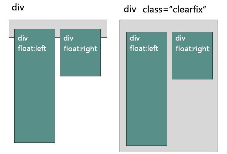
A clearfix is a way for an element to automatically clear its child elements, so that you don’t need to add additional markup. It’s generally used in float layouts where elements are floated to be stacked horizontally.

The clearfix is a way to combat the zero-height container problem for floated elements.

A clearfix is performed as follows:

.clearfix:after {
   content: " "; /* Older browser do not support empty content */
   visibility: hidden;
   display: block;
   height: 0;
   clear: both;
}

Or, if you don’t require IE<8 support, the following is fine too:

.clearfix:after {
  content: "";
  display: table;
  clear: both;
}

Read about it in this article – by Chris Coyer @ CSS-Tricks

The problem happens when a floated element is within a container box, that element does not automatically force the container’s height adjust to the floated element. When an element is floated, its parent no longer contains it because the float is removed from the flow. You can use 2 methods to fix it:

    {clear: both;}
    clearfix

Once you understand what is happening, use the method below to “clearfix” it.

.clearfix:after {	
    content: ".";	
    display: block;	
    clear: both;	
    isibility: hidden;	
    line-height: 0;	
    height: 0;
} 

.clearfix {	
    display: inline-block;
} 

html[xmlns] .clearfix {	
    display: block;
} 

* html .clearfix {	
    height: 1%;
}

Cross-browser @media (width) and @media (height) values

Cross-browser @media (width) and @media (height) values 

var w = Math.max(document.documentElement.clientWidth, window.innerWidth || 0);
var h = Math.max(document.documentElement.clientHeight, window.innerHeight || 0);

window.innerWidth and .innerHeight

  • gets CSS viewport @media (width) and @media (height) which include scrollbars
  • initial-scale and zoom variations may cause mobile values to wrongly scale down to what PPK calls the visual viewport and be smaller than the @media values
  • zoom may cause values to be 1px off due to native rounding
  • undefined in IE8-

document.documentElement.clientWidth and .clientHeight

  • equals CSS viewport width minus scrollbar width
  • matches @media (width) and @media (height) when there is no scrollbar
  • same as jQuery(window).width() which jQuery calls the browser viewport
  • available cross-browser

Resources

Flexbox – the same columns height

Make Bootstrap Columns All the Same Height

HTML:

<div class="container">
<div class="row is-flex">
<div class="col-sm-4">
<div class="box">
<h2>Title</h2>
<p>Lorem ipsum dolor sit amet, consectetur adipisicing elit, sed do eiusmod tempor.</p>
<a class="btn btn-primary" href="#">Link 1</a></div>
</div>
<div class="col-sm-4">
<div class="box">
<h2>Title</h2>
<p>Lorem ipsum dolor sit amet, consectetur adipisicing elit, sed do eiusmod tempor.</p>
<a class="btn btn-primary" href="#">Link 2</a></div>
</div>
<div class="col-sm-4">
<div class="box">
<h2>Ttitle</h2>
<p>Lorem ipsum dolor sit amet, consectetur adipisicing elit, sed do eiusmod tempor incididunt.</p>
<a class="btn btn-primary" href="#">Link 3</a></div>
</div>
</div>
</div>

CSS:

.row.is-flex {
  display: -webkit-box;
  display: -webkit-flex;
  display: -ms-flexbox;
  display: flex;
  flex-wrap: wrap;
}
.row.is-flex > [class*='col-'] {
  display: -webkit-box;
  display: -webkit-flex;
  display: -ms-flexbox;
  display: flex;
  flex-direction: column;
}

Solution 2 using table

.row {
    display: table;
}

[class*="col-"] {
    float: none;
    display: table-cell;
    vertical-align: top;
}

More Different Tricks on How to Make Bootstrap Columns All the Same Height: https://scotch.io/bar-talk/different-tricks-on-how-to-make-bootstrap-columns-all-the-same-height